-
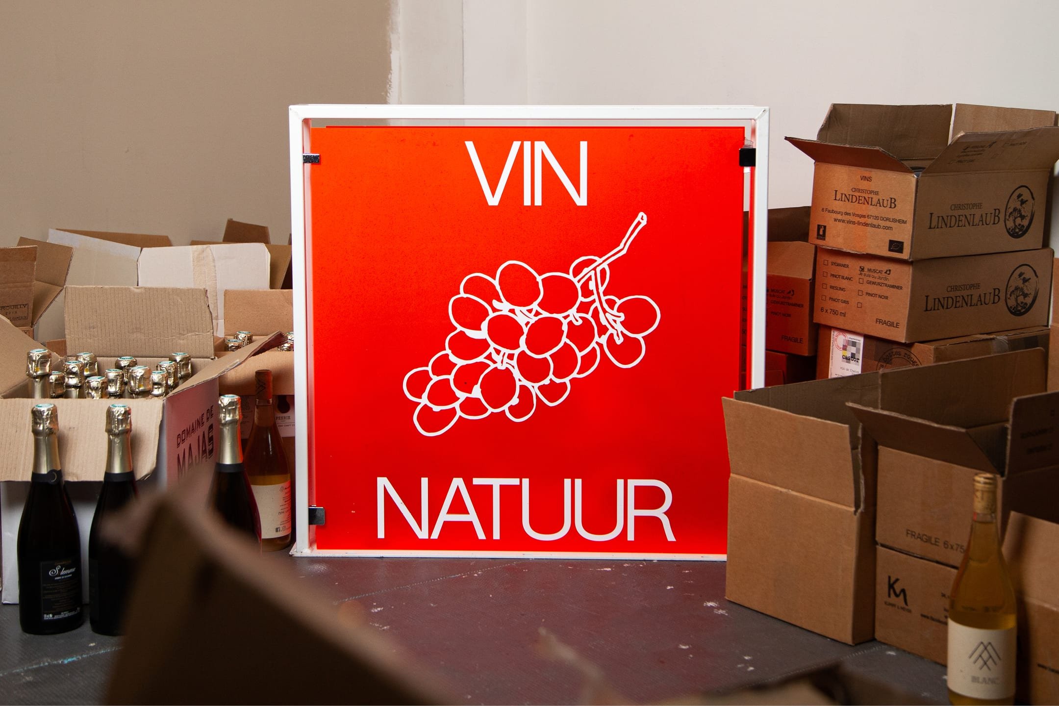
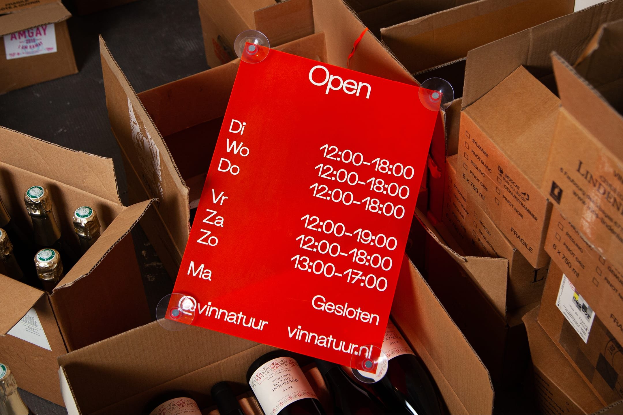
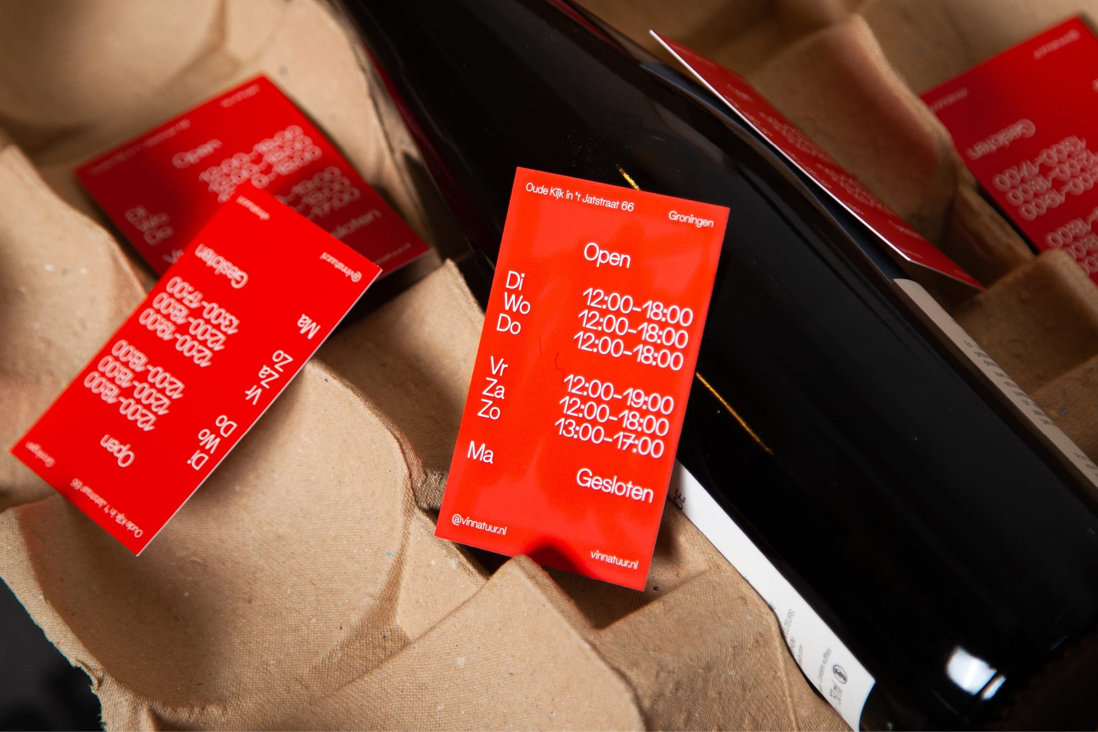
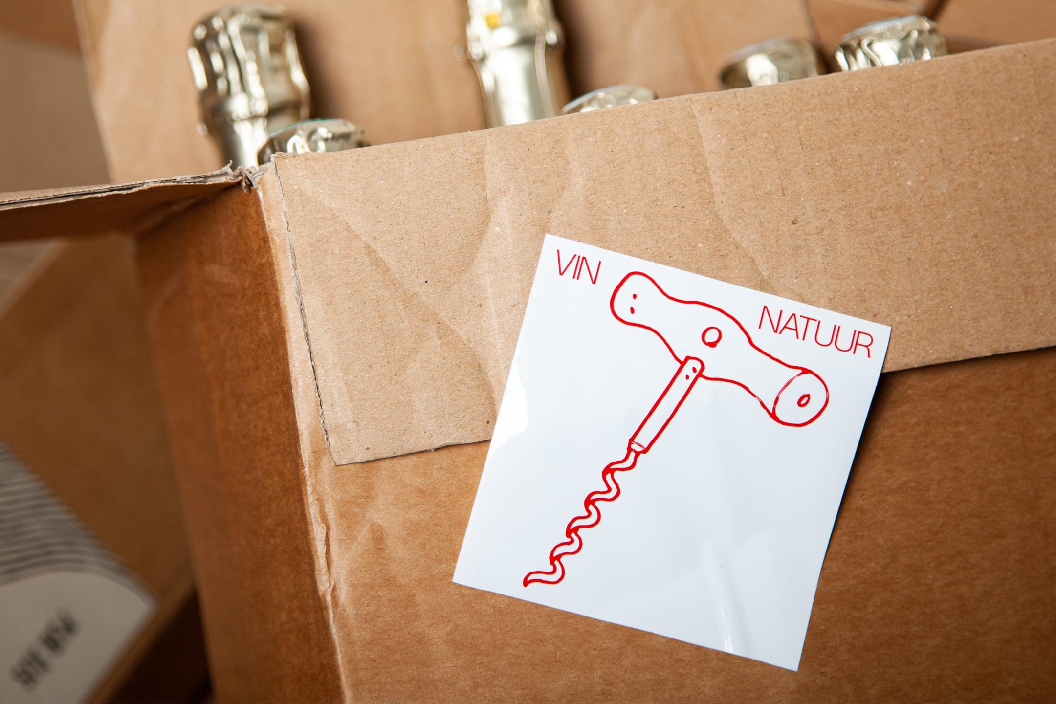
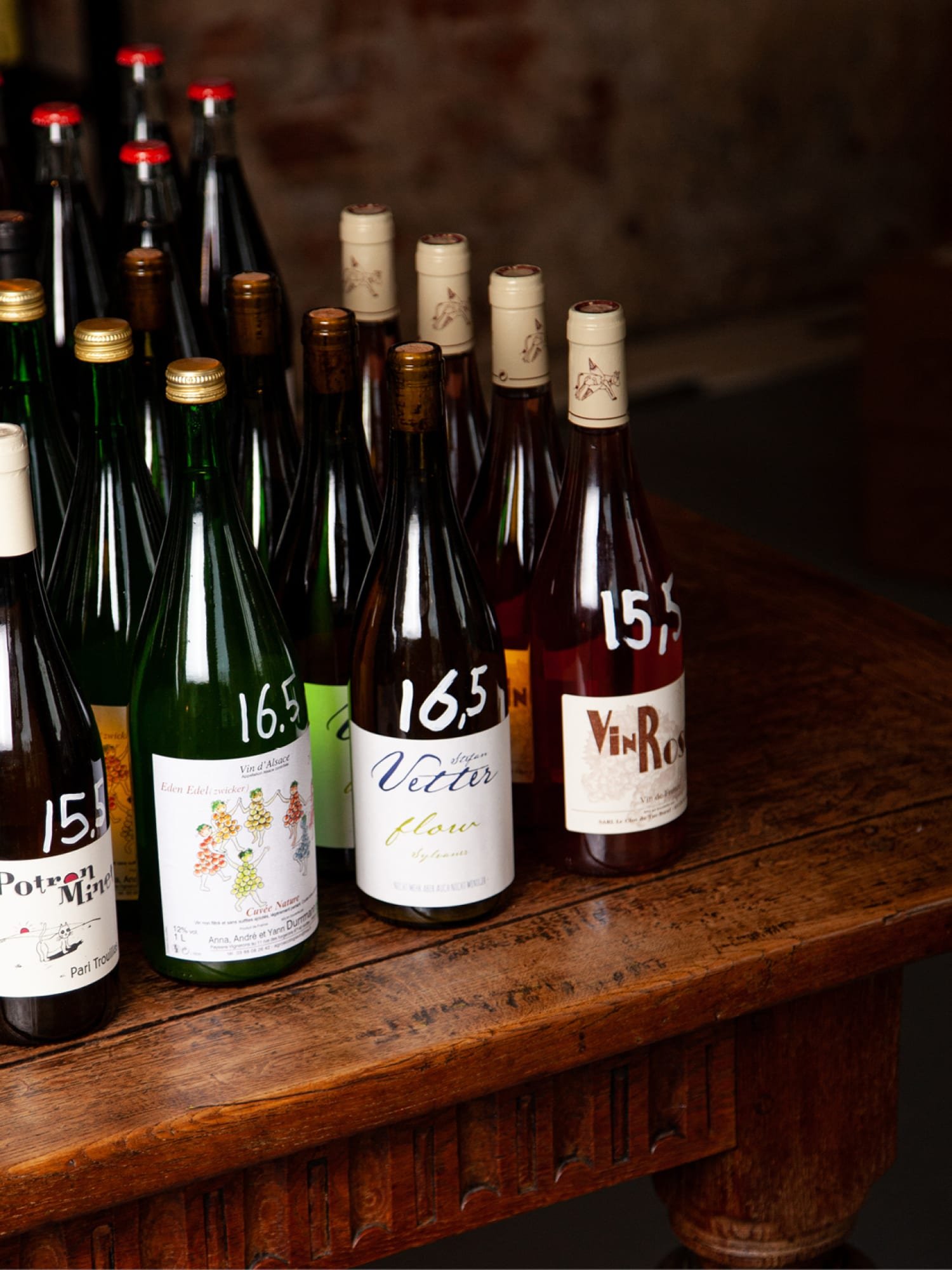
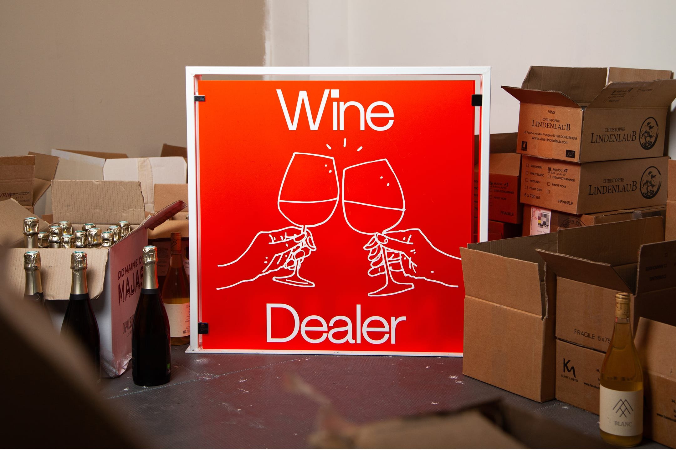
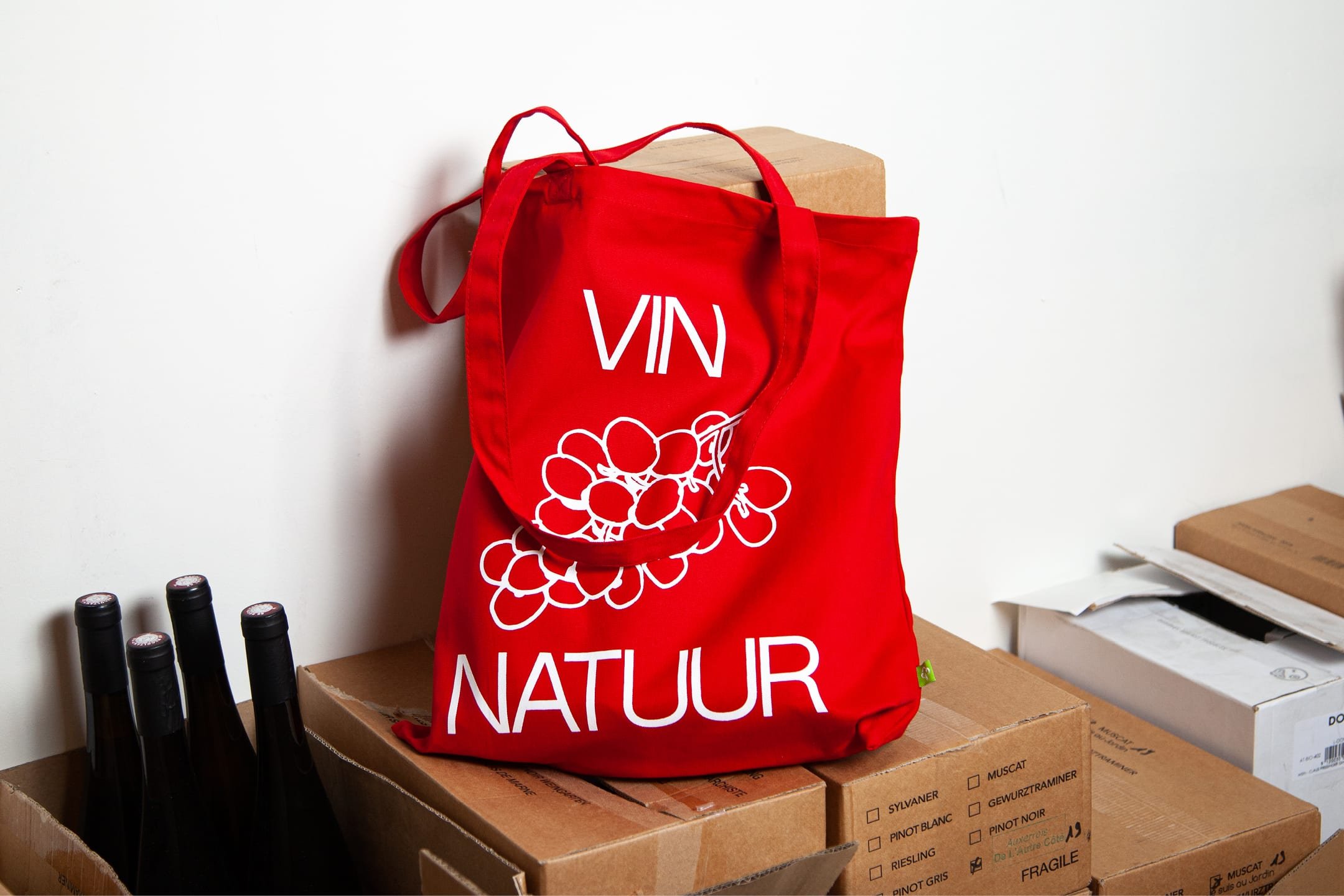
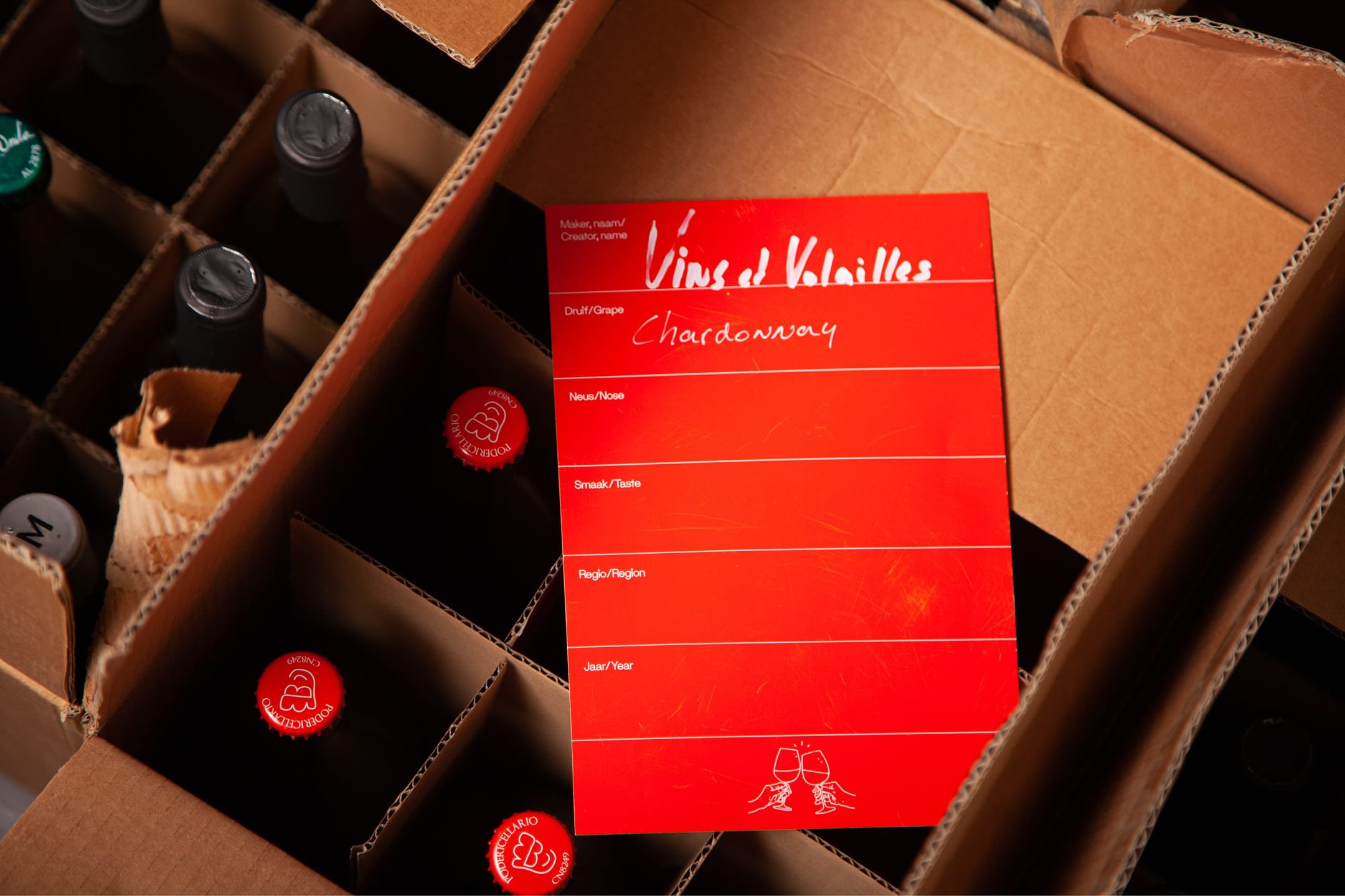
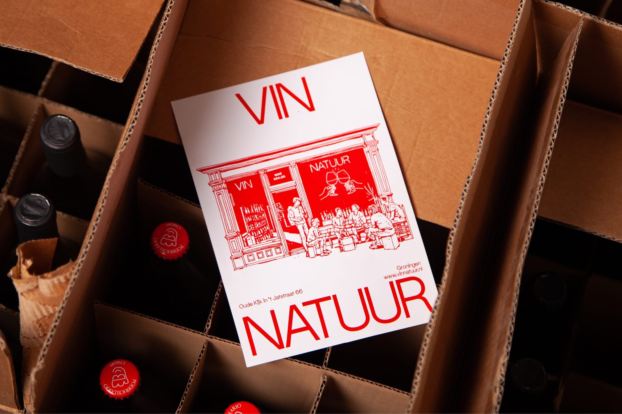
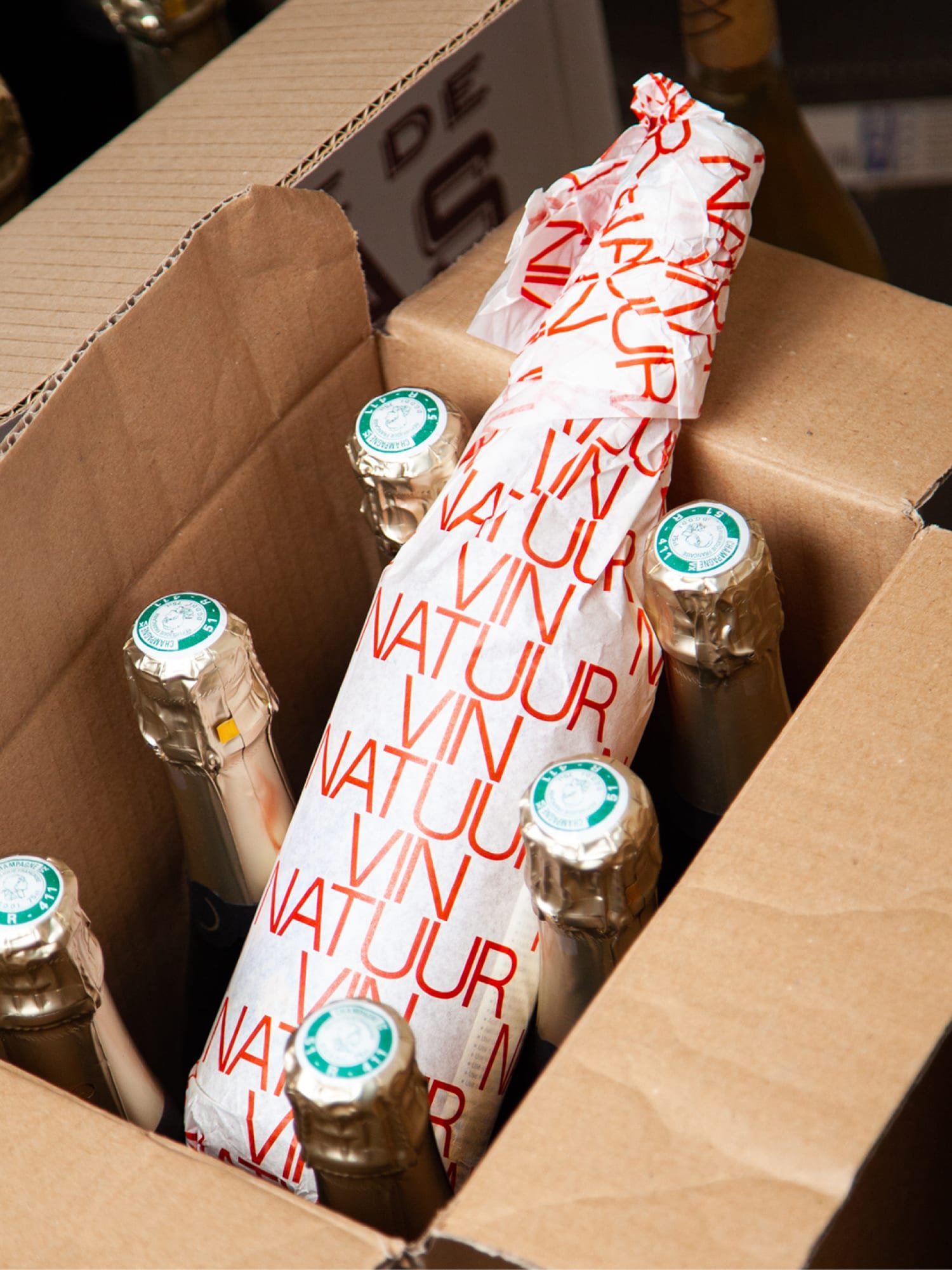
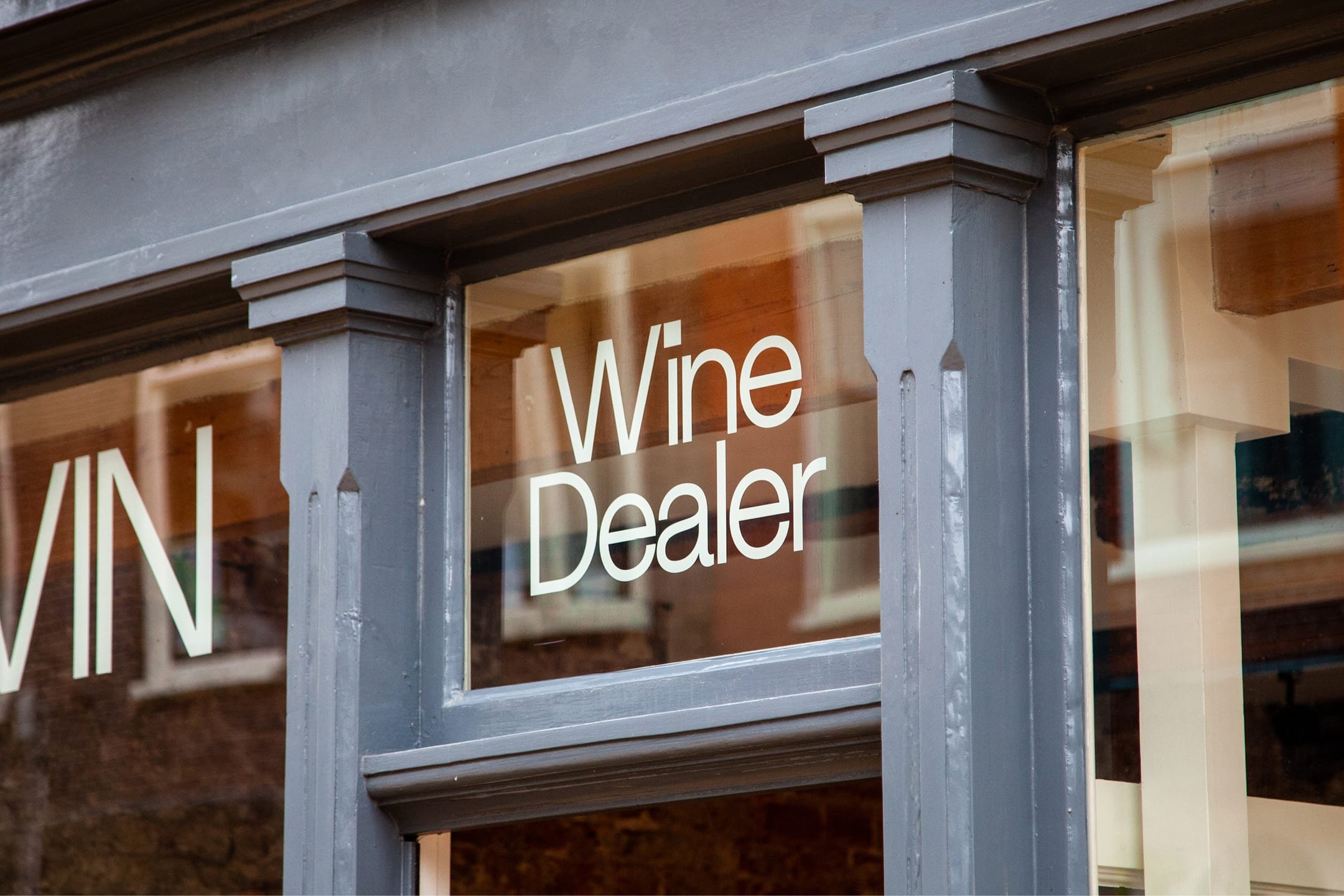
Visual identity and art direction for Vin Natuur, wine dealer in Groningen, The Netherlands. Vin Natuur believes in natural vinification. This means, as little intervention as possible, both in the vineyard and in the wine cellar. To provide a more versatile palette of flavours and scents.
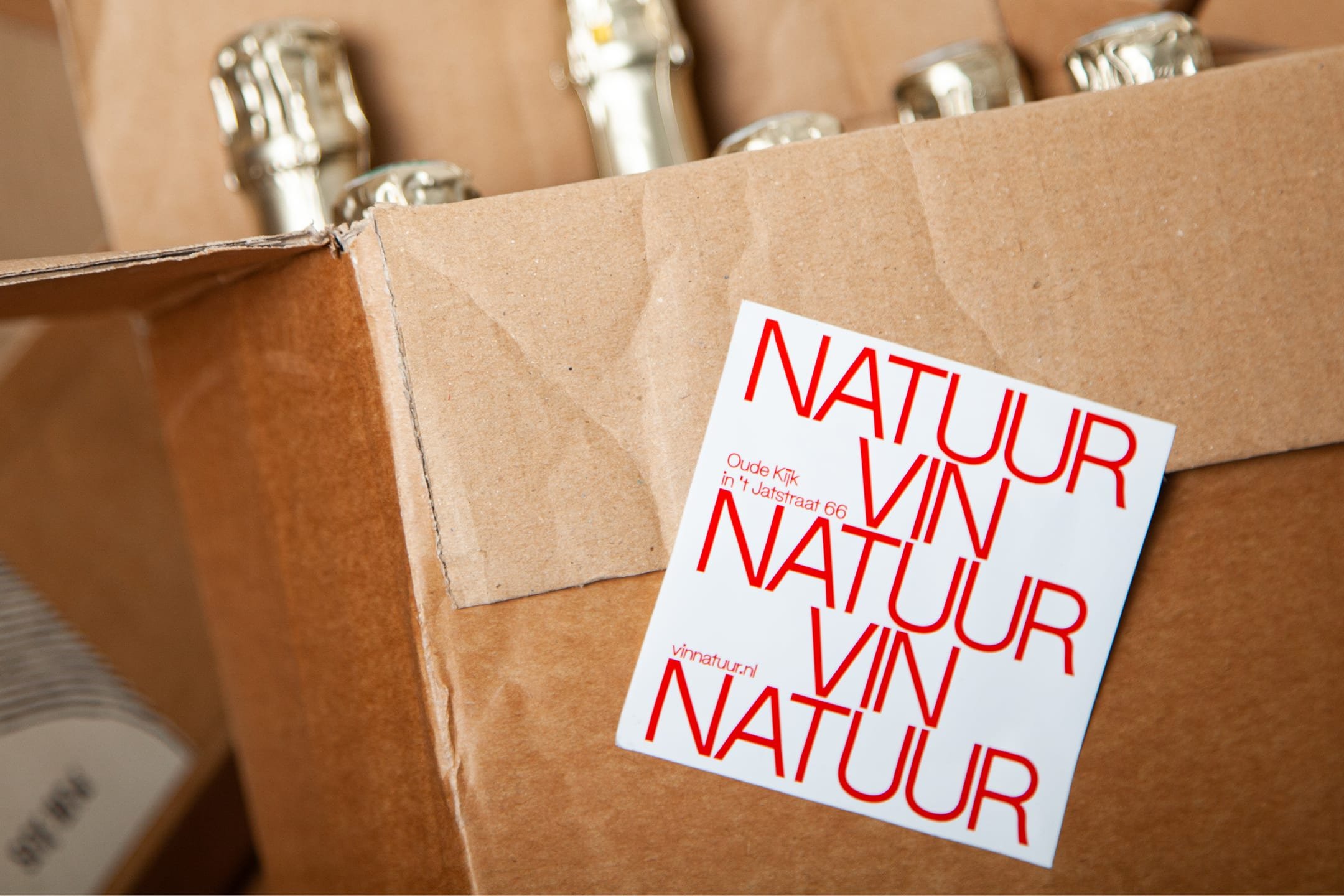
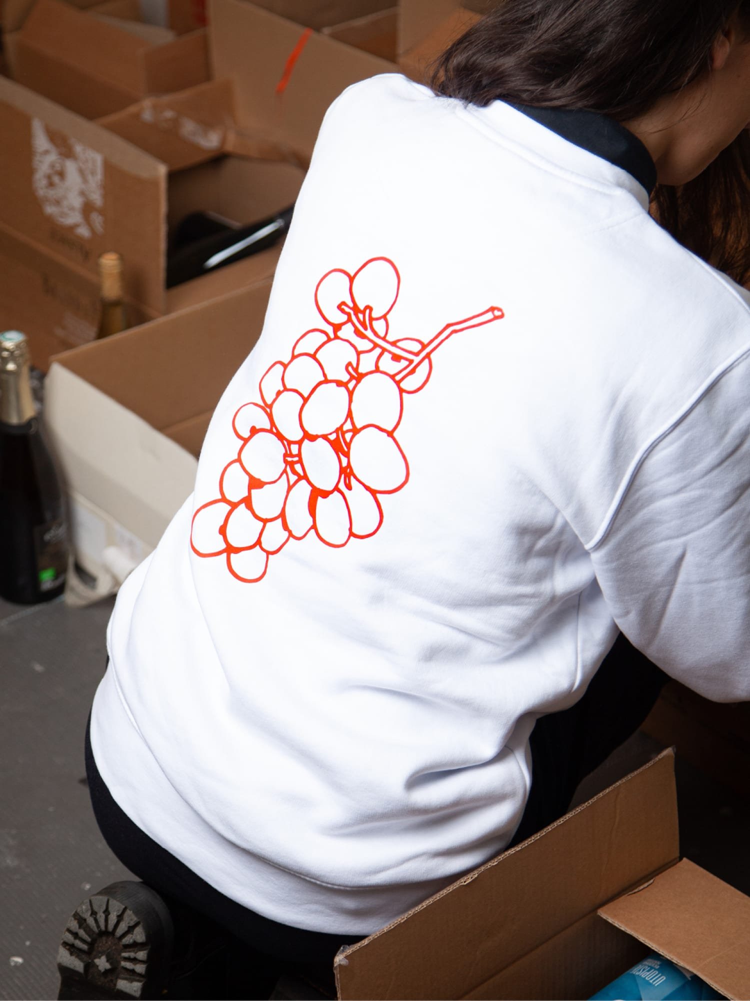
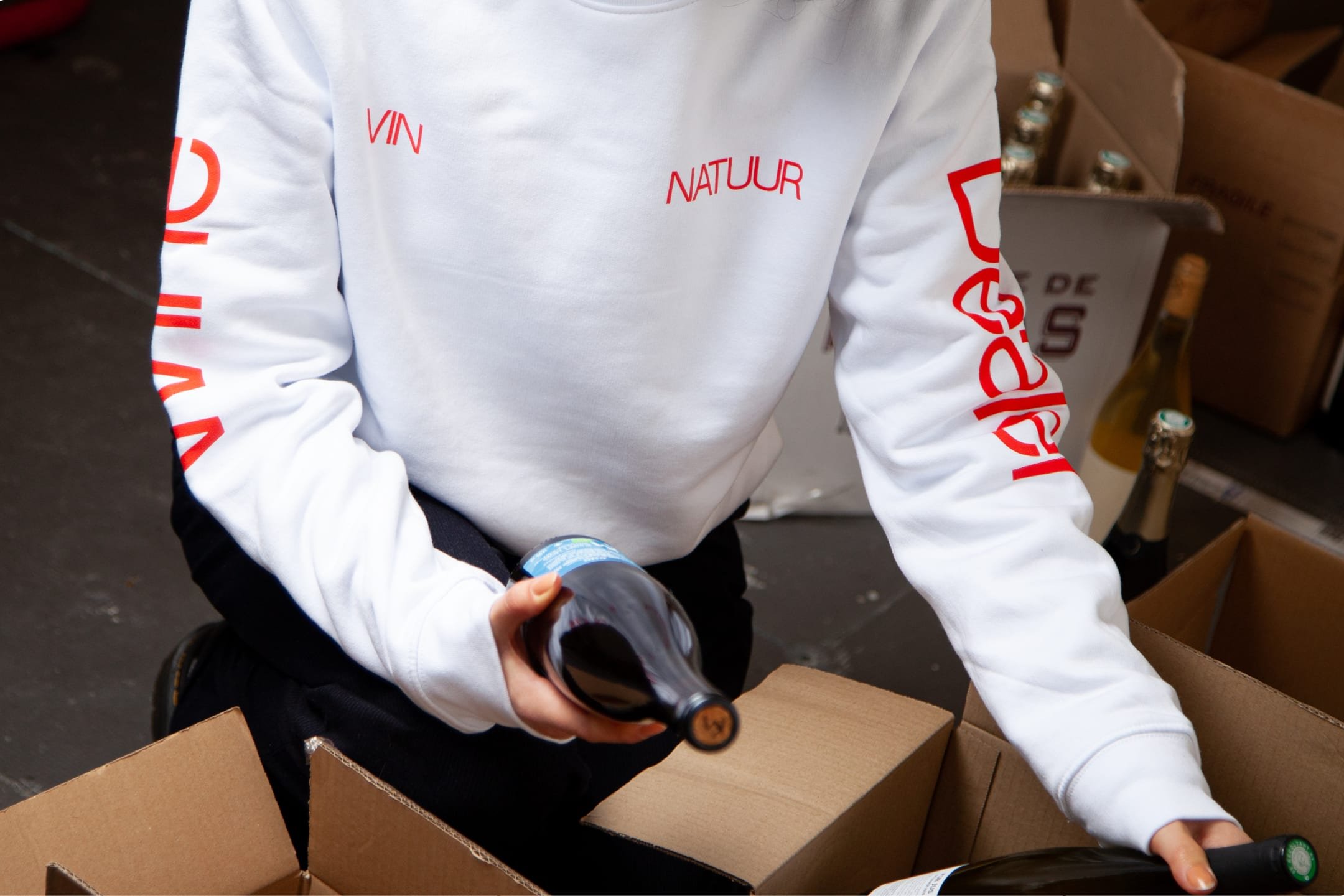
The graphic language and outspoken art direction are distinguished by its bright red color and the combination of bold typography with characterising illustrations. This reflects both the cleanliness of the natural vinification process as well as the outspoken character that natural wines tend to have.
CLIENT
Vin Natuur
SERVICES
Visual identity, art direction, communication design
CREDITS
Illustrations – Joost Stokhof
Typeface – SM Maxéville by Soft Machine
Created at G2K Creative Agency